
Story of the Logo
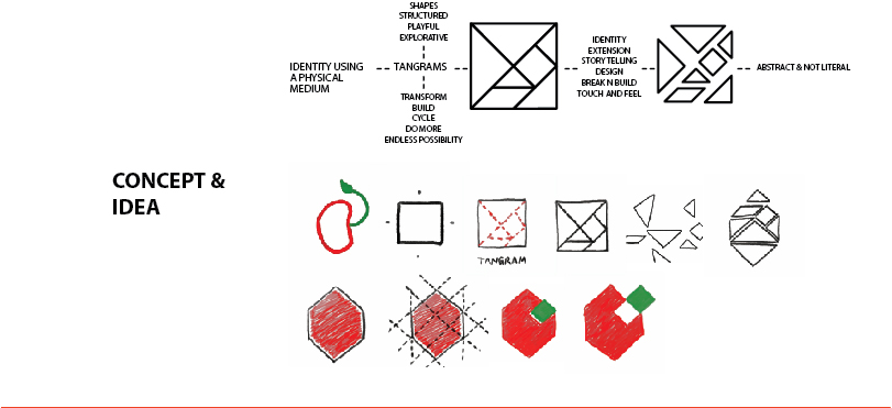
The graphic element of the logo is a geometric representation of a sprouting seed. It’s based on the tangram, a puzzle comprising seven geometric elements. It’s symbolic of the puzzle of undernourishment, and how, by looking at the problem differently, we have created a pioneering solution. It also cues endless possibilities – the seven elements of the tangram can be grouped into 6,500 different shapes. Similarly, the Nourishing Schools programme can create a quantum change in the fight against undernutrition.
![]()
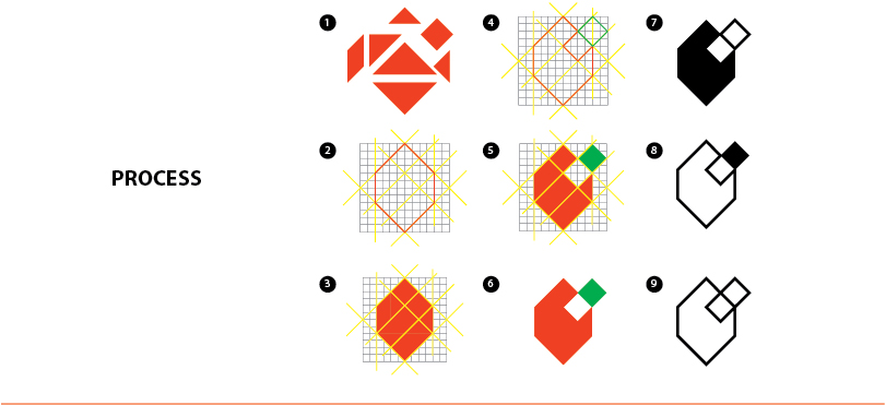
The seed itself stands for the crux of our programme – children. Filled with promise and purpose, they’re just venturing out into the world. We want to help them grow to their fullest potential.
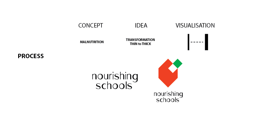
And finally, the font in which ‘Nourishing Schools’ is written. You’ll notice that it’s thin at the start and then fills out towards the end, becoming robust and rounded. It’s symbolic of an undernourished child finally gaining nourishment to assume his or her true, healthy form.
COMMENTS